Getting customers to act, on time
Vimla is a digital mobile operator owned by Telenor. To support 5G, every one of its customers had to move to a new SIM card. Anyone who hadn’t switched by a set date was migrated automatically and lost service until they put the new card in. I owned the design and built parts of the flow with my colleagues.
- 350k
- users to move to a new SIM card
- 2 rounds
- of A/B tests, think-alouds and heat-mapping
- Less churn
- than in Vimla’s previous migration
The challenge
Moving a customer took about two weeks and several steps. The riskiest came near the end, when customers had to swap the SIM card themselves on a set date, and a misunderstanding meant a break in service. Handled badly, the migration would flood support and frustrate customers into leaving.
The goal
Vimla had moved its customers once before. Anyone who hadn’t switched by a set date would be migrated automatically, and we believed customers who were migrated without noticing would be far more likely to leave. So the goal was to get as many as possible to switch themselves before then, and to lose fewer customers than last time without flooding support.
My hypothesis
- The biggest risk is customers never noticing the migration. If the key information sits where people already look, they will act.
What I did
Testing the managers’ ideas as well as mine
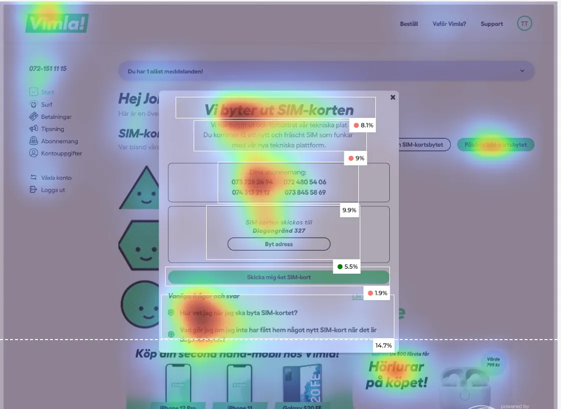
The managers had their own expectations of what would work. I convinced them to test those with users alongside my hypothesis. I chose the methods, designed the prototypes and ran two rounds of think-alouds, A/B tests and heat-mapping.
The message goes on the start screen
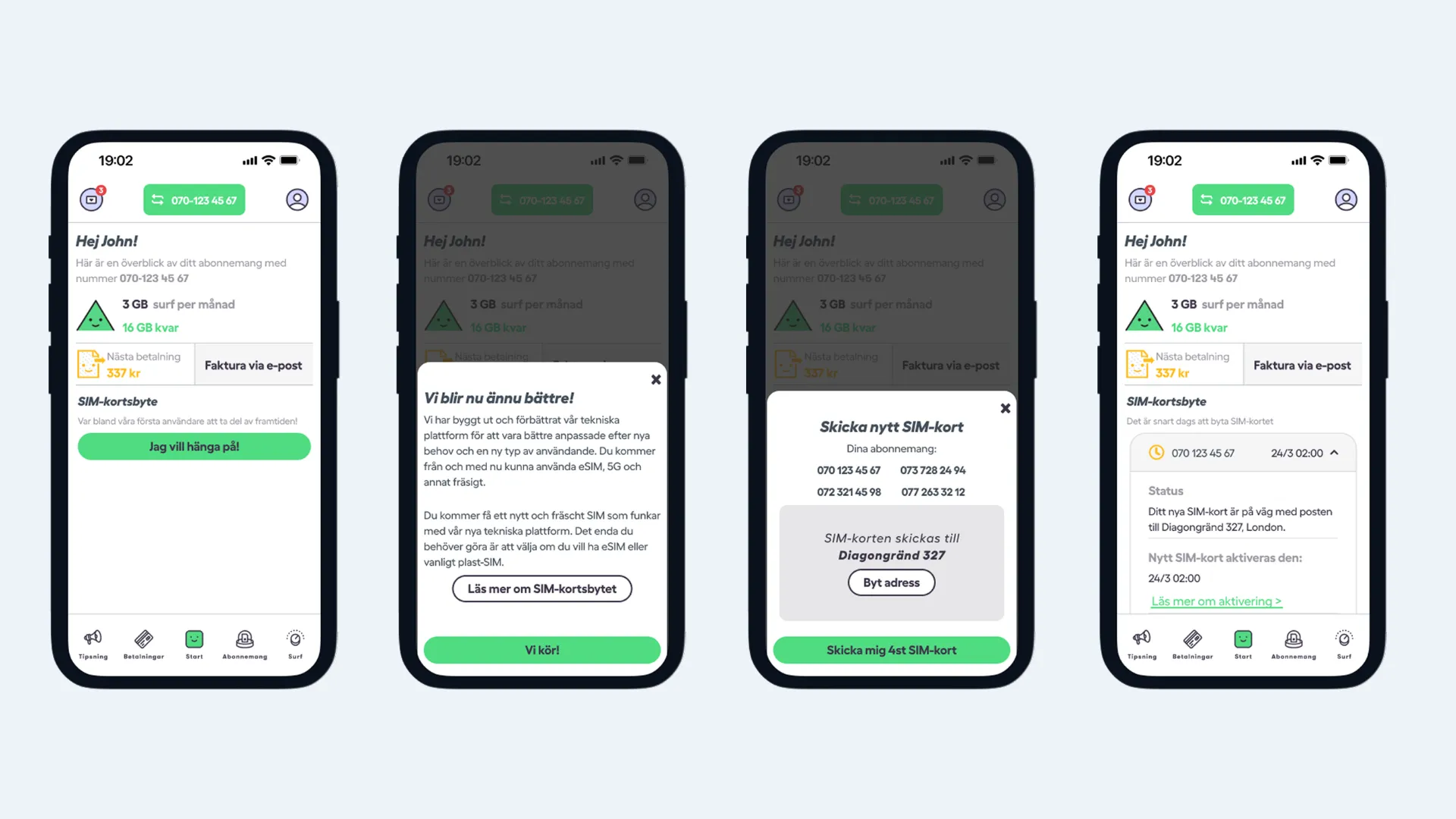
The message worked best on the start screen, just above the greeting with the customer’s name, in an active purple from Vimla’s selected brand colours. So the start screen also became the place to begin the migration and follow its status. The button colours steered what people looked at and clicked, so the main action got the strongest colour.
Why the address fields start empty
The same colours and copy made people confirm the pre-filled delivery address without checking it. So the fields now start empty, and customers fetch their registered address with one tap or type it in.
Short copy, shown when it matters
Instead of explaining everything up front, I spread the copy across the process, showing each part when it mattered, and kept it short.
The outcome
Churn was lower than in Vimla’s previous migration, and support requests were lower than expected. The tests also changed how we worked. The findings surprised the managers, and they found the process valuable enough to ask for it in later projects.